Dashboard redesign & UX improvement
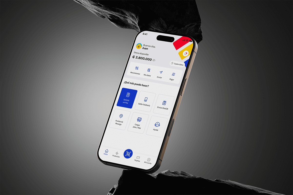
Rebuilding EKO Wallet's core dashboard to resolve critical usability issues, modernize the visual language, and lay down an evolvable design system — without touching the backend.
Project overview
A functional dashboard that had quietly stopped scaling.
Background. EKO Wallet is an established digital wallet platform that was facing challenges common to rapidly scaling fintech products. The existing dashboard architecture and design, while functional, had accumulated key UX and usability issues over time — friction that hindered the introduction of new features and limited the platform's ability to maintain a modern, premium feel in a competitive market.
Challenge. Redesign the core EKO Wallet dashboard to resolve critical UX pain points, significantly enhance overall usability, and establish an evolutive design system that supports future scalability — crucial for improving satisfaction and retaining users who expect a seamless, modern digital experience.
Objectives
Solve key usability issues — identify and eliminate the primary sources of user frustration, from complex navigation to information overload.
Improve feature discoverability — make core functions (transfers, payments, balance checks) intuitive and instantly accessible to every user segment.
Evolve scalability & design system — build a flexible design architecture and visual language that accommodates future product growth without breaking consistency.
Renew the look and feel — modernize the visual aesthetic to align with contemporary standards and a genuinely "premium" feel.
Team
1 Product Owner
1 Product Designer
2 Junior UX Designers
2 Backend Developers
3 Mobile Developers
4 QA Analysts
My role
Sr. Product Designer
End-to-end product design
User testing
Funnel analysis
Timeline
12 months
About the wallet
What EKO Wallet is
EKO is the Paraguayan digital wallet that lets users manage their money simply and securely, endorsed by Banco Familiar. The platform provides a free international MasterCard debit card for global purchases, and inside the app users can instantly send and receive money, pay bills, and recharge services — total control over their finances from a single application.

Context
Starting point
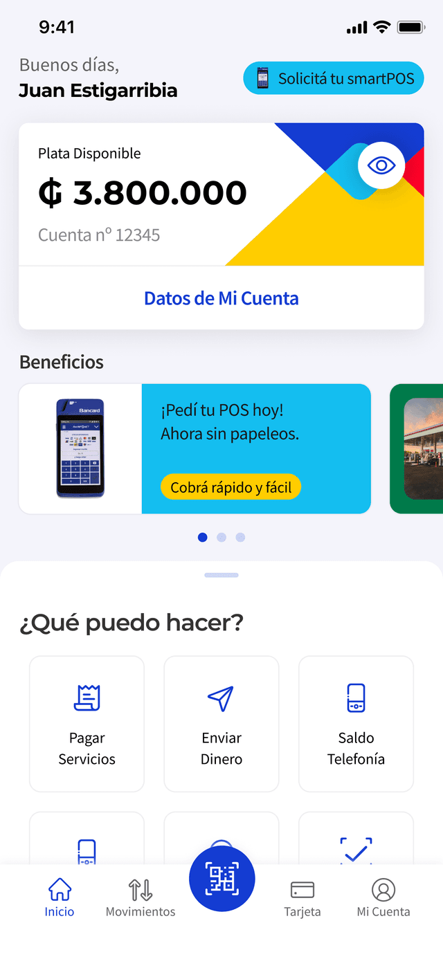
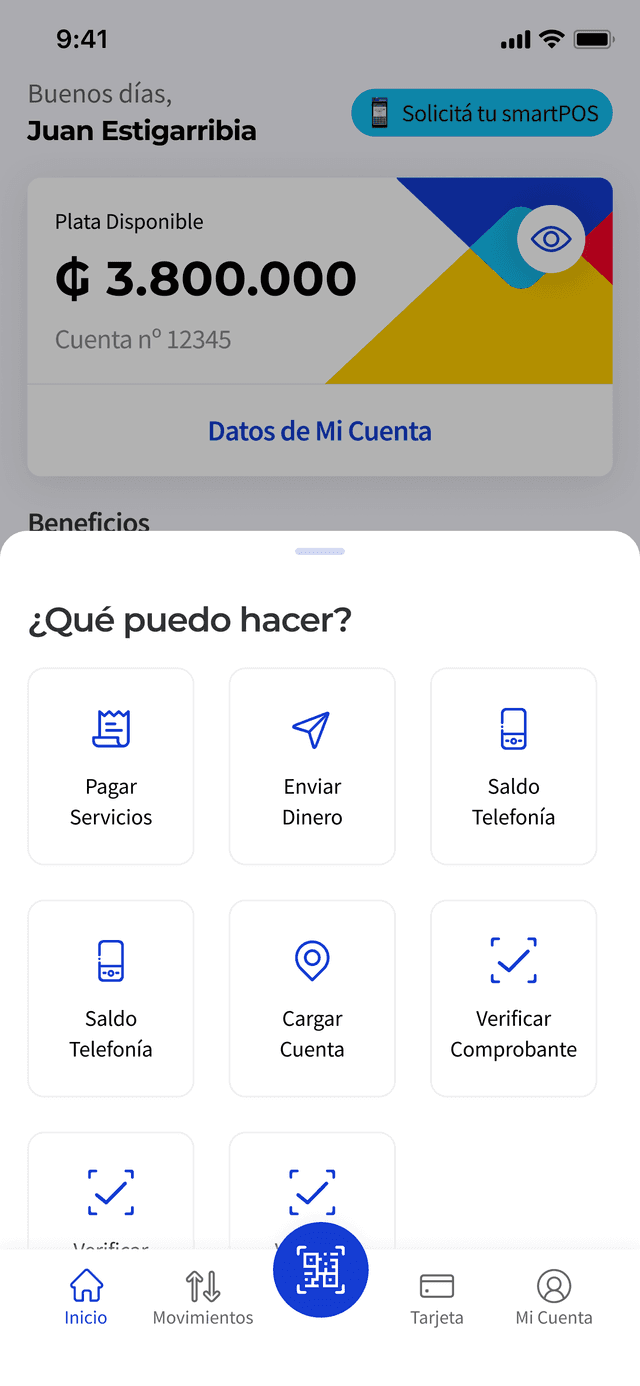
Dissociated actions & account data
Core actions were disconnected from the account overview, requiring deep navigation. This created poor mental models and confusion about money management.
Cluttered navigation & low usability
A visually dense interface and cluttered navigation created high cognitive load. Essential actions were difficult to complete, leading to poor activation and churn.
Lack of business scalability
The rigid framework prevented easy integration of new features like loans or savings — a major roadblock to competitive growth.
Existing screens
Initial premise
One redesign, three constituencies to satisfy
User's perspective
Ease the understanding of the product.
Business
Drive higher user engagement and transaction volume.
Tech
Ship it without refactoring the backend.
Process
From discovery to a validated, cross-functional design.
Our process began with a deep discovery phase combining internal data analysis and user research to understand why users failed to activate and transact. This work surfaced the key friction points — navigation clutter and dissociated actions — described above. We then ran a cross-functional design sprint with Engineering and Business to quickly validate solutions, making sure the new dashboard was scalable, feasible within the "no backend refactoring" constraint, and aligned with the goal of increasing transaction volume.
Discovering issues & setting the stage
Joined the project as lead designer and ran a working session with the Product Owner to dissect the dashboard experience — surfacing navigation and transaction friction as the core problems to solve.
Design sprint & team collaboration
Ran a focused design sprint with board members and the CTO as key specialists, to align on scope before a single screen was drawn.
Interface design & team leadership
Led two junior UX designers through the new information architecture and visual system, reviewing every screen against the sprint's decisions.
User research & validation
Tested the new dashboard's mental model with real users before build, specifically probing whether actions now felt connected to account data.
Prototyping & iteration
Iterated high-fidelity prototypes against mobile engineering constraints, tightening the design each cycle without losing the "no backend refactor" promise.
Decision logs
Documented every major trade-off — why a banner was capped, why a shortcut was cut — so product and engineering could trace decisions back to the sprint.
Collaboration beyond design
Worked directly with backend and mobile engineering throughout, so the "no refactor" constraint shaped decisions early rather than causing late rework.
Outcomes & next steps
Shipped the new dashboard as the default experience, with the design system in place to absorb the next wave of features — gifting and investments among the first to land.
Lessons learned
Constraints are a design tool, not an obstacle — the "no backend refactor" rule forced a cleaner information architecture than an open-ended rebuild would have.
Deliverables
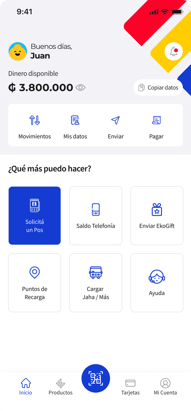
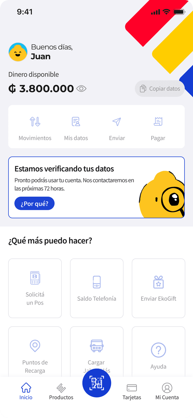
The new dashboard
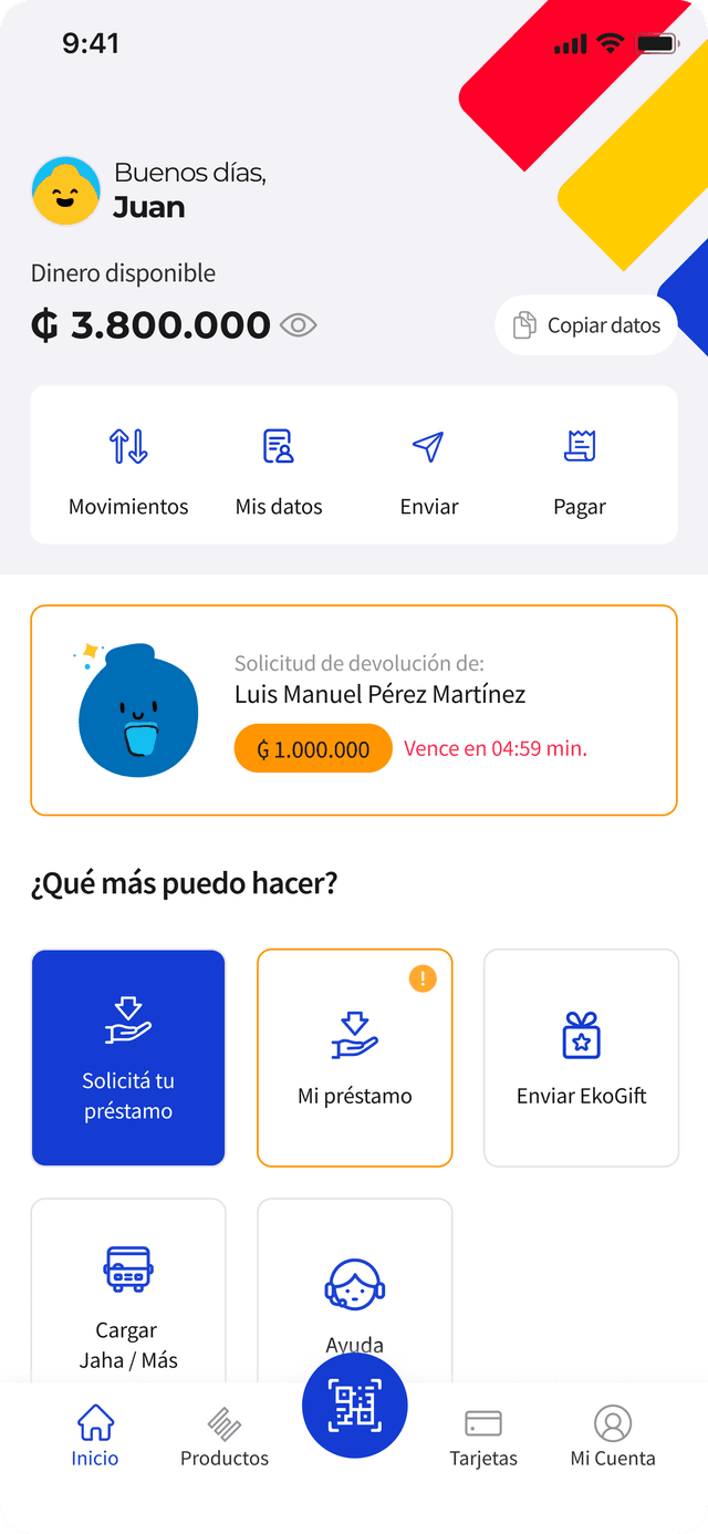
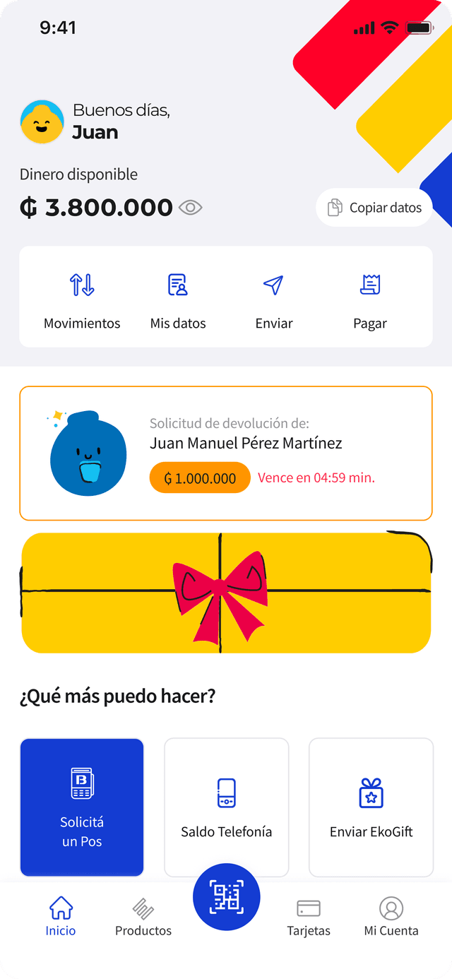
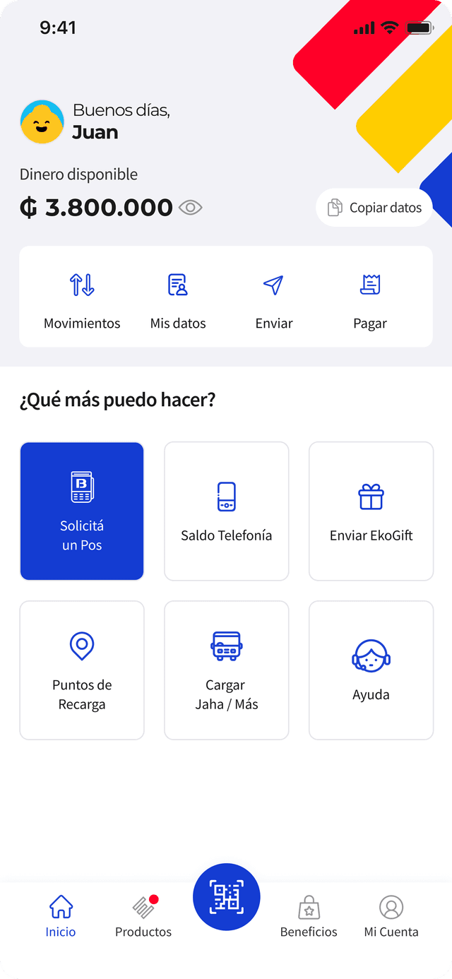
Rebuilt around four connected zones: products, highlighted actions, banners, and the account overview itself — no longer disconnected from one another.
Products & benefits
Every product now surfaces its own benefits inline, instead of hiding them behind a details page.
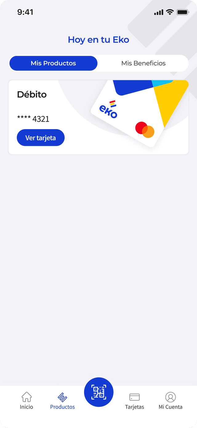
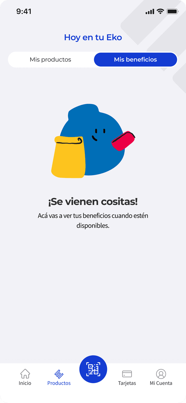
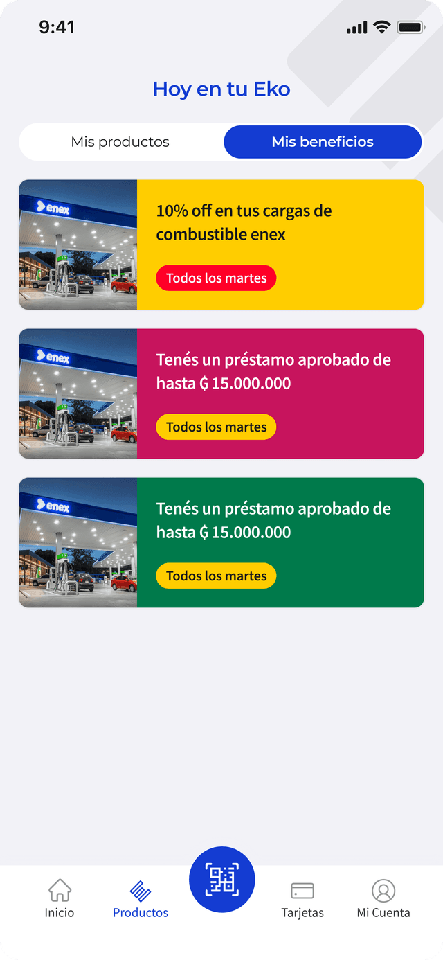
Multiple states
Every card was designed for its empty, loading, and populated states from day one — not patched in after launch.
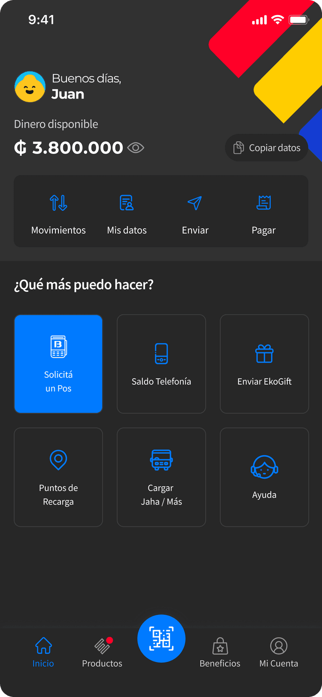
New feature: dark mode support
The redesign shipped alongside full dark mode support — not a filter over the light theme, but tokens designed to hold up in both.
Result
A dashboard that scales with the roadmap instead of fighting it.
The redesign reached over 490K users and shipped as the entry point for EKO Wallet's next wave of features, including gifting and investments — giving both a real discovery path from day one. Reported performance on the new dashboard improved by 300% over the previous architecture, and the design system it introduced is now the default way the team ships new dashboard placements.