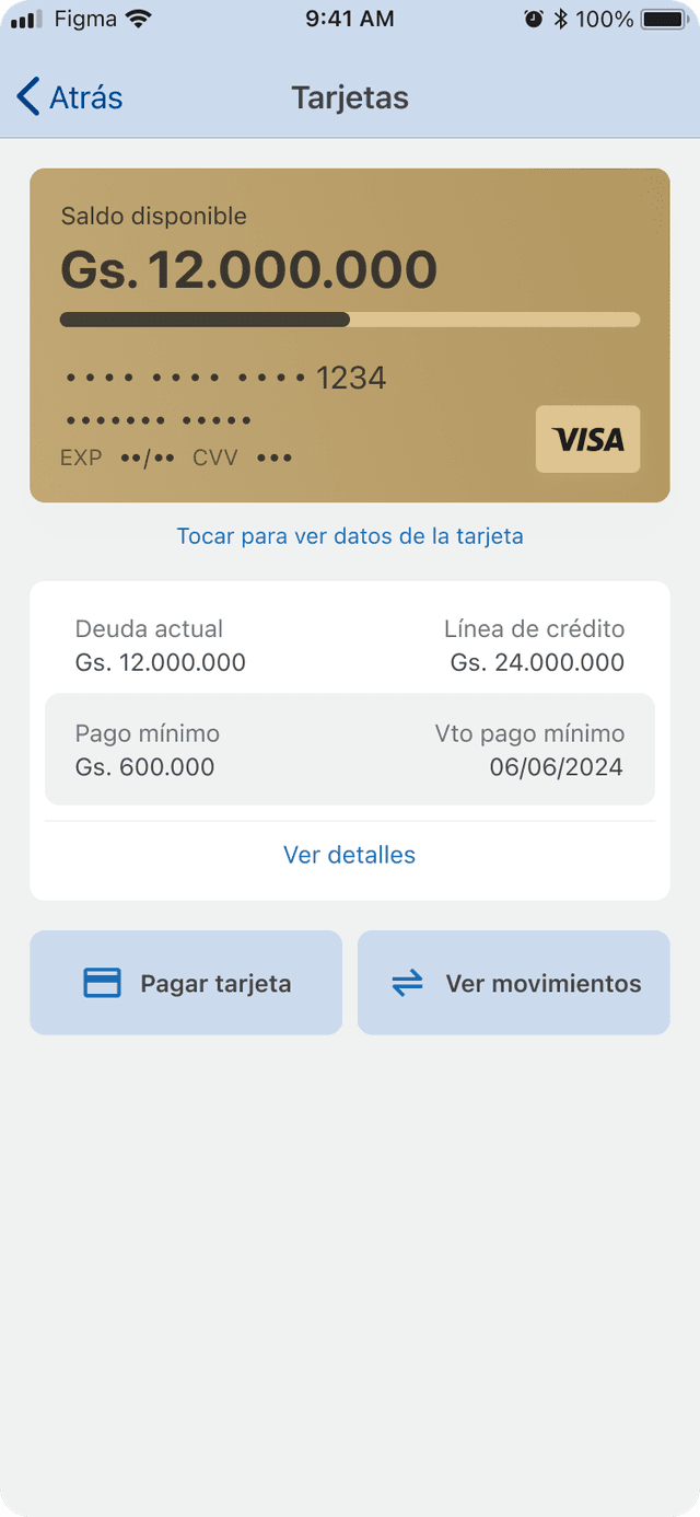
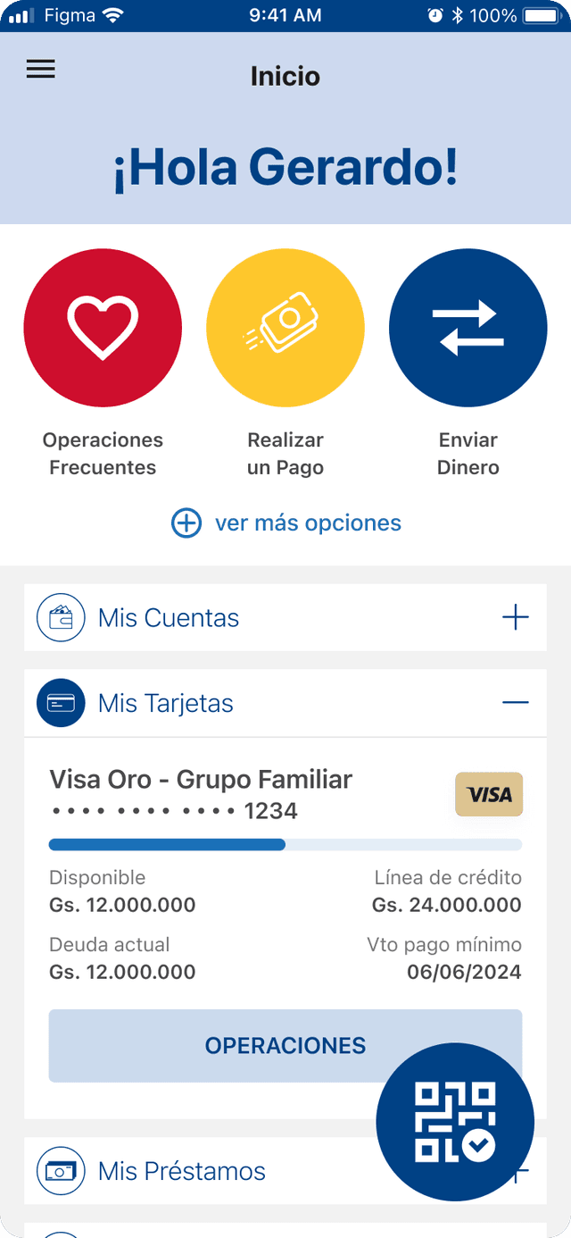
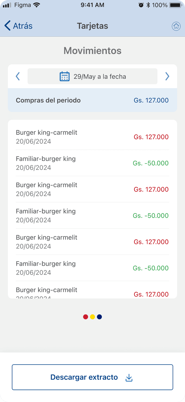
We redesigned the credit card section to bring it in line with the bank's current vision — moving from a significantly outdated interface to one that's modern, intuitive, and clean.
The previous design suffered from more than a dated aesthetic: its dense layout and confusing information architecture often left users feeling lost and unsupported. That eroded confidence and drove a high volume of recurring support inquiries about basic tasks and card features. For a product this core to trust, clarity had to become the design outcome.
What changed
A full visual overhaul with a modern design language, generous white space, and updated typography for scannability.
A simplified dashboard with a clear hierarchy — current balance and minimum payment due, instantly visible.
Intuitive, accessible navigation streamlining key actions like viewing statements or making a payment.
Upfront, context-specific information built into the section to answer questions before users need support.
Improved accessibility standards — color contrast and touch targets — for a high-quality experience for everyone.
Before
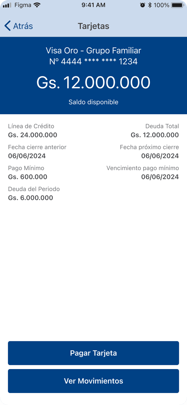
After